what color should i pick?
... or did the colors pick me?
An Anaylysis : The Psychology of Color in Web Design ( gravoc.com )
SUMMARY
The article “Color Psychology in Website Design” from GraVoc explains how color choices
significantly impact first impressions—studies show people form opinions about websites or products within 90
seconds, with up to 90% of that judgment based on color alone. It then guides readers through how different
colors convey specific emotions and brand messages—for example, red suggests energy and importance, blue
conveys reliability and calm, and green evokes growth and renewal. The piece concludes by encouraging brands
to reflect on what their organization stands for and choose a color palette that aligns with the desired
emotional reaction.
CRITIQUE
This article give a great guide to understanding the basics of
the psychology of color. The opening statistic about people’s quick judgments of what they see resonates
immediately as we can all confirm this through our own lived experience. Giving both a video and text to
explain the emotions behind different colors makes the article inclusive to different kinds of learners and is
very clear and concise.
REFLECTION
This article really helped me be aware of my own reactions
to color. I am interested to dive into the more nuanced color choices as well and am curious to know why some
people prefer certain colors over others. I know I definitely have strong preferences to certain colors and
I’d like to know why that is. It definitely shows how understanding your audience/customer is an important
element of choosing colors for your brand or business.
If we can use color psychology to help us pick colors that emphasize the purpose of our business or subject
matter, can I use color to help me understand my own motivations?
I have struggled to really nail
down a vision for my brand as a photographer. I know color is a huge part of this journey for me and I often
find myself feeling scattered when it comes to creating a cohesive look for my website/portfolio. The pressure
to create a body of work that has a specific understandable style and color theme for consumers has often felt
limiting. However, the more experienced I become I am starting to notice reoccurring colors in my editing and
am seeing that I am drawn to certain colors and tones more than others. I am wondering what my color choices
say about me and how I can use this to market myself as a photographer.
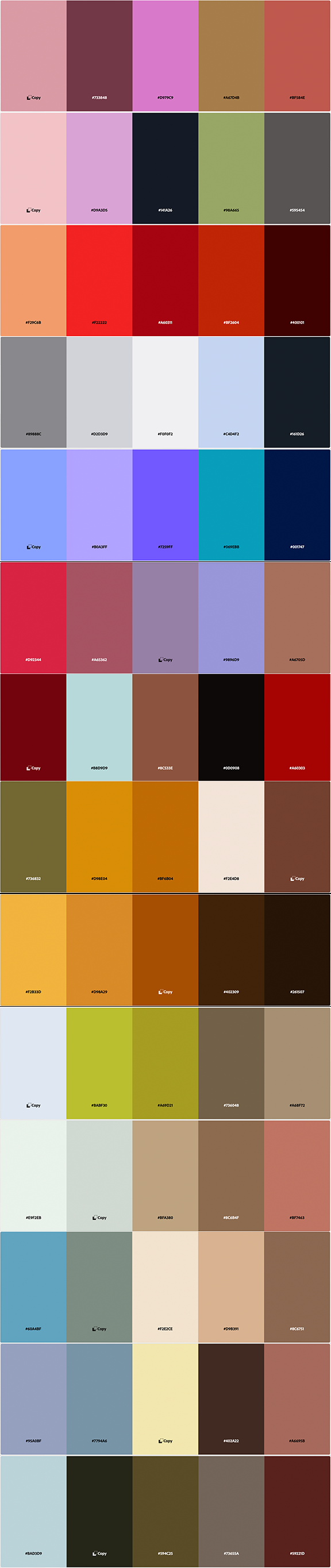
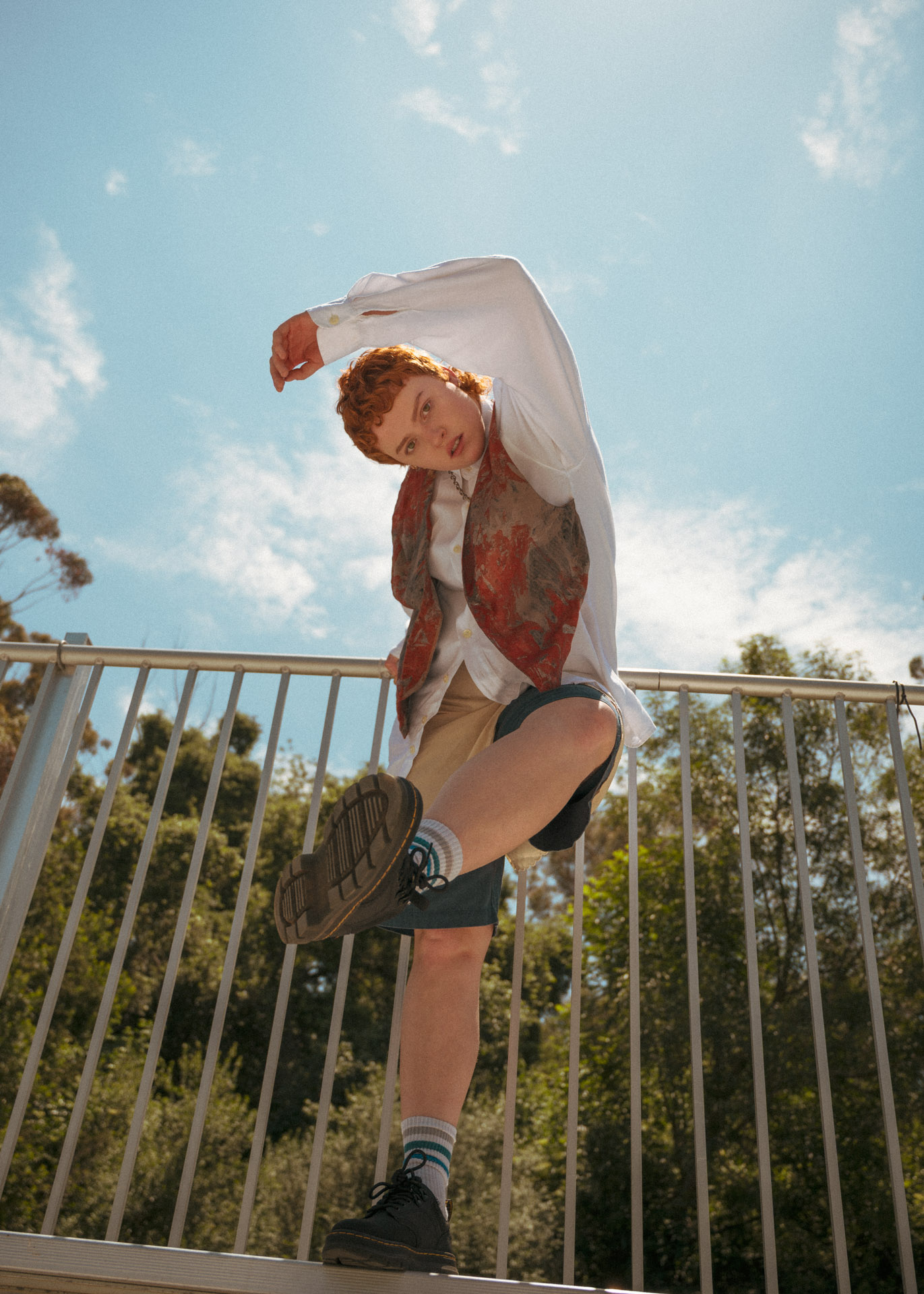
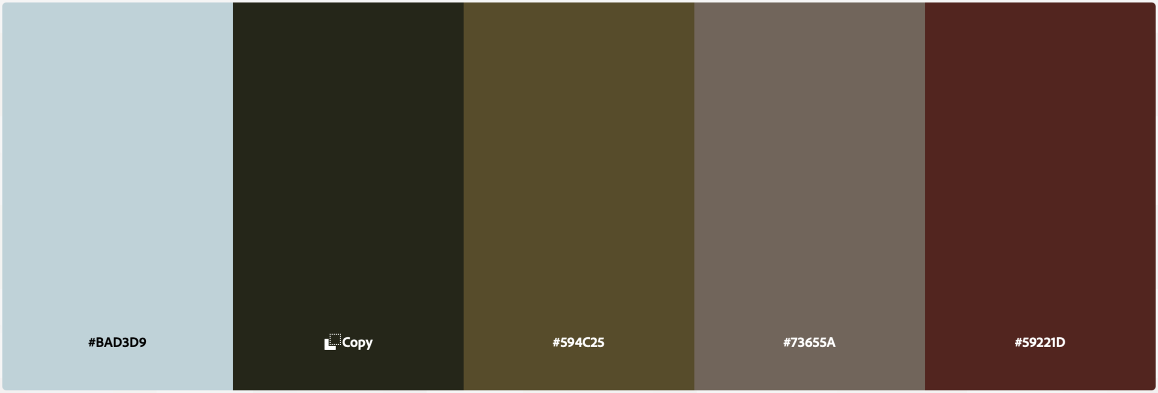
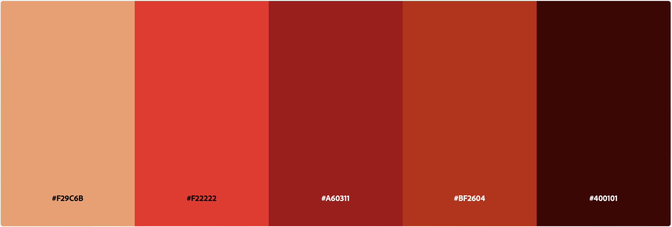
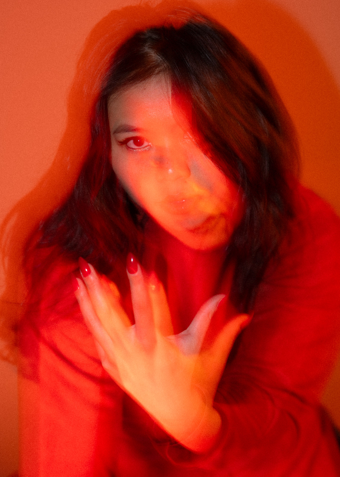
To start I picked out 14 of my favorite images from my portforlio. Then, using the Adobe Color website,
which was featured in the gravoc.com article, I used the “Extract Theme” feature to create 14 unique color
palettes based on those images. (Side note: this was extremely satisfying and I could have done it all day
long) Next, I took all 14 of these color palettes and compiled them into one file of 60 unique colors, which
you can see to the left of this text. I had my colors! I then used chatgbt to analyze the colors and create
some concrete data.
Figuring out some actual descriptive words to bring to my work feels amazing. The colors I used actually just
told me a lot about what I want to project in my life and my photography business.
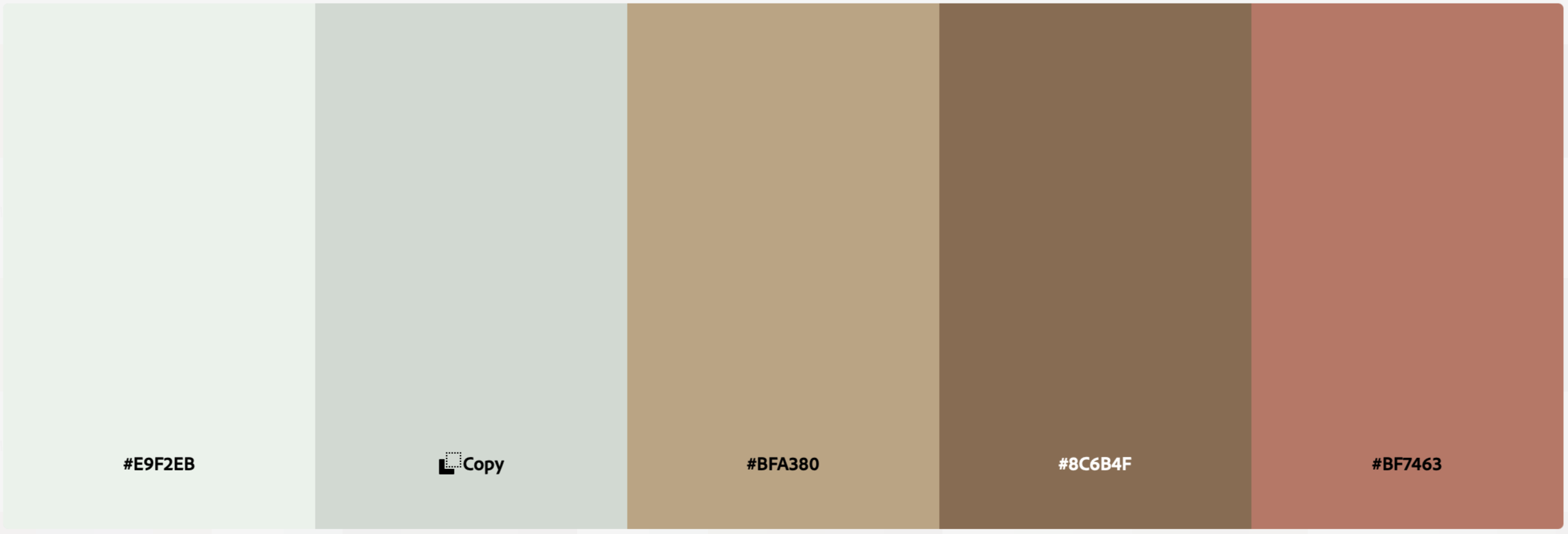
I also learned
I like to mix more dusty muted tones with vibrant and saturated colors, which apparently fits well for
editorial spreads. Editorial photography excites me the most of all genres so this felt validating and
exciting.
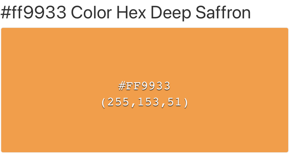
Lastly, I wanted to know what one color in the palette was the most dominant. When all 60
colors were analyzed for hue, saturation, and brightness, the averages revealed a hue of 22.7 degrees, a
saturation of 52.1%, and a brightness of 61.5%, a red-orange tone called Deep Saffron (#FF9933)
Orange has always been one of my favorite colors and happens to be the color of the logo I
designed for my photography business. I think my biggest take away from this experiment is that, while maybe
not consciously, I actually do have a pretty good idea of my style and I might just be on the right track of
creating a cohesive brand for myself after all. Honestly liberating!
50%
of my colors are warm - Warm tones dominate my my color palette and the presence of reds, oranges, browns
and golds are consistent. Using color psychology we can associate this with energy, earthiness, and
warmth.
30%
of my colors are cool - The less dominate cool colors in my palette mostly consist of blues, teals, unique
purples, and muted greens providing a sense of balance and calmness.
20%
of my colors are neutrals - These neutrals are a grounding force to the colors and help provide
contrast.
ENERGETIC . WARM . CALM . GROUNDED